-
 Perfect Bind Notebook ₹125.00
-
 Personalized Coffee Mugs ₹235.00
-
 Custom Canvas Prints ₹715.00
-
 Premium Laminated Cards From ₹3.30 per unit
Perfect Bind Notebook ₹125.00 Personalized Coffee Mugs ₹235.00 Custom Canvas Prints ₹715.00 Premium Laminated Cards From ₹3.30 per unit Perfect Bind Notebook ₹125.00 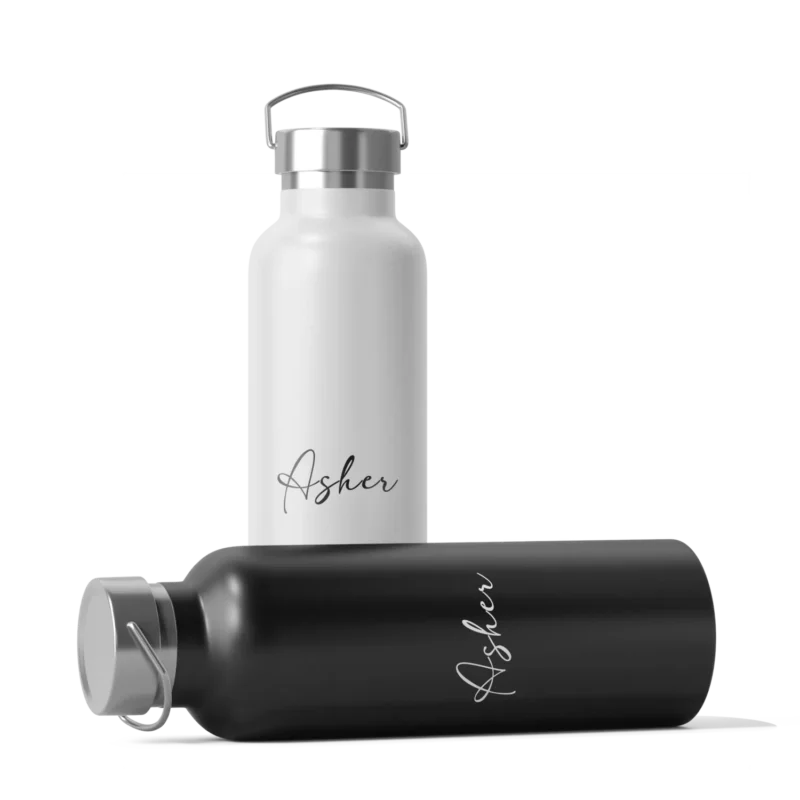 Stainless Steel Bottles ₹450.00
  5-in-1 Gift Set ₹2,500.00 Premium Laminated Cards From ₹3.30 per unit
  Eco-Friendly Business Card From ₹4.60 per unit
  Circle Visiting Cards From ₹2.25 per unit
  Metallic Business Cards From ₹5.80 per unit
  Matte Laminated Business Cards From ₹3.20 per unit
  Glossy Laminated Visiting Cards From ₹2.35 per unit
 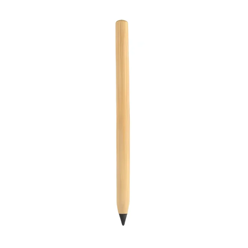 Personalized Bamboo Pencils From ₹45.00 per unit
 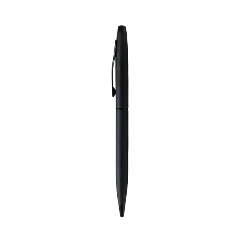 Premium Black Ballpoint Pen ₹410.00
 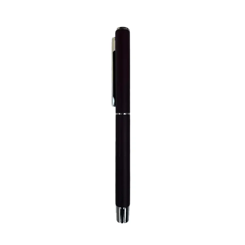 Metallic Ballpoint Pens ₹180.00
 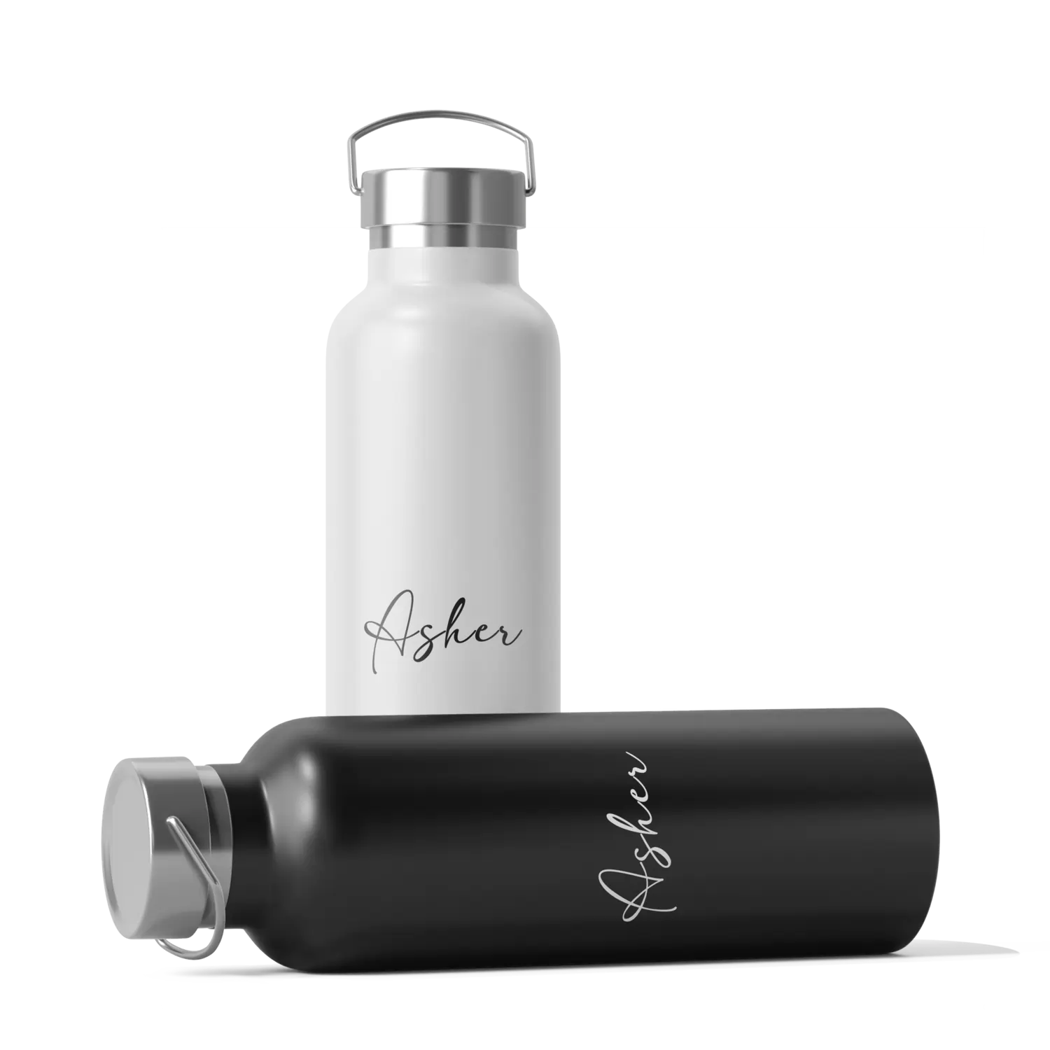 Stainless Steel Bottles ₹450.00
  Temperature Water Bottles ₹900.00
 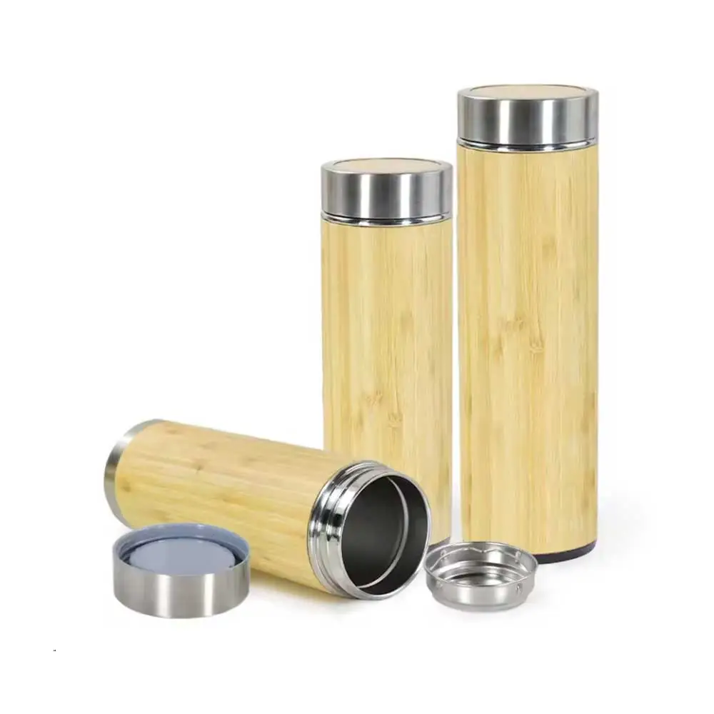 Personalized Bamboo Water Bottles ₹1,150.00
 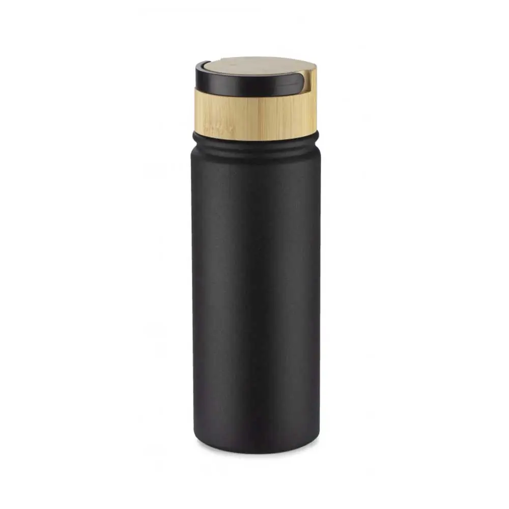 Thermos Water Bottles
  Awards and Certificates
 Lanyards From ₹52.50 per unit
  Lanyard with Side Lever Hook From ₹55.00 per unit
 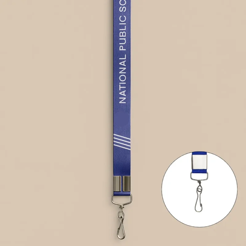 Lanyard with Twisted Hook From ₹52.50 per unit
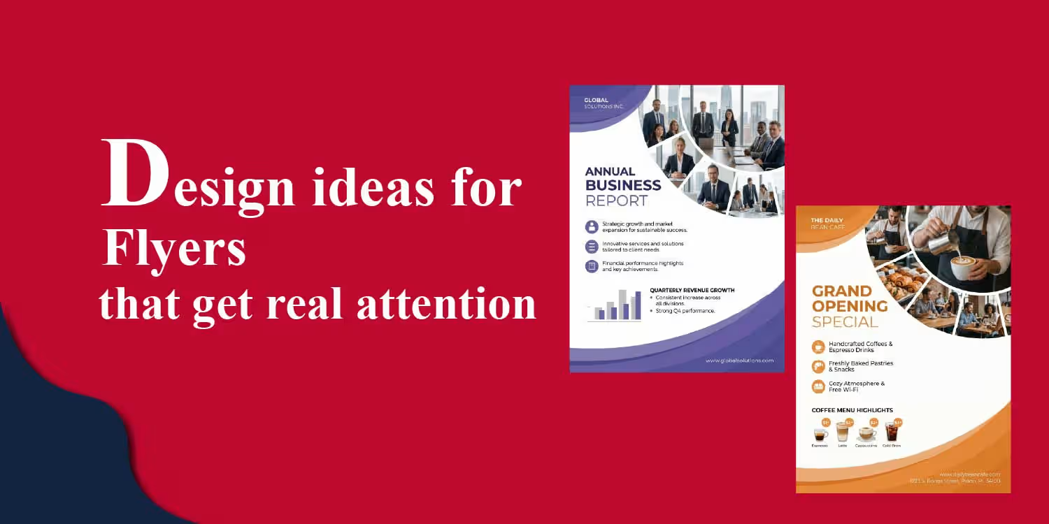
Flyers continue to be one of the most reliable and cost-effective tools for business promotions, especially for local marketing, retail campaigns, events, and corporate outreach. Even with the rise of digital advertising, physical marketing materials like flyers still create a direct and tangible connection with customers through custom flyer printing solutions at Quapri. A well-designed flyer is not just a piece of printed paper—it works as a powerful marketing communication tool that can influence buying decisions within seconds. That’s why choosing the right flyer design ideas for business promotions is so important for any brand.
In this guide, we’ll walk you through simple, practical, and essential flyer design ideas that help businesses grab attention, communicate clearly, and convert more customers.
Flyer design ideas refer to simple yet strategic ways of planning the look, layout, and content of a promotional flyer so it quickly grabs attention, communicates the message clearly, and encourages people to take action. These ideas usually bring together elements like typography, colors, images, and layout styles to make the flyer more engaging and effective.
In business promotions, flyer design isn’t just about making something look good—it’s about communicating a message in a way that drives awareness, attracts interest, and ultimately helps generate leads and sales.
Flyers still work really well today because they connect with local and offline audiences in a direct, personal way. Unlike digital ads that people can easily scroll past, skip, or forget, flyers physically stay with the customer—on their desk, fridge, or bag—keeping your message visible for much longer.
For small businesses, startups, and even large brands, flyers still play an important role in marketing. They work best when combined with digital efforts, creating a balanced mix of offline and online promotion that improves overall reach and impact.
Every successful flyer is built on a few simple but powerful principles that make it easy to read, visually appealing, and action-driven:
Your message should be instantly clear—ideally in just 3–5 seconds. If someone has to stop and “decode” what the flyer is about, you’ve already lost their attention.
A good flyer naturally guides the reader’s eyes in the right order so they know exactly where to look first:
One flyer = one goal. Whether it’s promoting a sale, an event, or building brand awareness, stick to a single clear message. Too many ideas on one flyer only dilute the impact.
Always tell people what to do next in a simple, direct way, such as:
All visual elements like colors, fonts, and logo placement should align with your brand identity to build trust and recognition.
The success of any flyer depends on how well it captures attention and communicates the message quickly. The following flyer design ideas are practical approaches that help improve visibility, engagement and response.
Your headline is the very first thing people notice on your flyer, so it acts like the main hook. It decides in a split second whether someone keeps reading or just moves on.
A strong headline should:
People don’t really “read” flyers—they scan them quickly in just a few seconds. A bold headline is what stops that quick scrolling and pulls their attention in.
A strong, well-placed headline can instantly improve engagement and make your flyer much more effective at converting attention into action.
A clean flyer design makes everything easier to read and understand at a glance. Minimal design doesn’t mean leaving things out—it simply means removing anything that doesn’t support your main message.
When a flyer is too crowded, the brain has to work harder to process everything. That often leads to confusion or people just skipping it altogether. A minimal design makes things clear instantly and reduces that mental effort.
Keep your focus only on three things:
When you stick to this approach, your flyer becomes much more effective. Minimal, clean designs consistently perform better across both retail promotions and corporate marketing because they communicate faster and more clearly.
Visual hierarchy is all about guiding the reader’s eyes in the right order so they naturally understand your message without feeling confused.
When everything on a flyer looks equally important, nothing really stands out. That creates confusion and people often lose interest quickly. A clear visual hierarchy fixes this by showing the viewer exactly where to look first, second, and so on.
When done right, visual hierarchy feels natural—your flyer guides the reader’s eyes smoothly from the headline all the way to the final action without them even thinking about it.
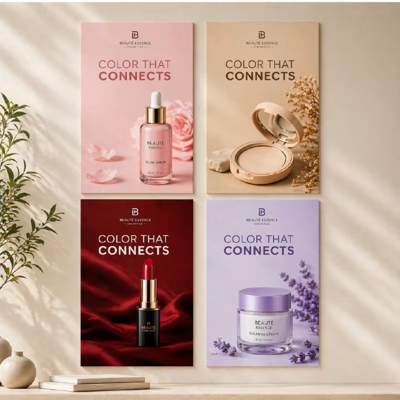
Images are usually the first thing people emotionally connect with on a flyer, so they play a huge role in grabbing attention and building interest.
Good-quality visuals instantly make your brand feel more trustworthy and premium. On the other hand, low-quality or unclear images can reduce trust right away—even if your offer is really strong.
Instead of just showing a product, try showing the outcome it creates. For example, happy customers, real usage scenarios, or visible results.
Strong, meaningful visuals make your flyer more relatable, more credible, and much more engaging overall.
A flyer feels incomplete if it doesn’t clearly tell people what to do next. The CTA is what turns interest into actual action.
Even the best-designed flyer won’t perform well if people are left wondering what to do next. The CTA is what directly drives conversions and helps you turn attention into real responses or sales.
A clear CTA is what completes the flyer—it turns attention into action.
Colors play a big role in how people feel about your flyer—even before they read a single word. They can quickly influence attention, emotion, and decision-making.
Color sets the mood of your flyer instantly. In many cases, people form an emotional reaction to the design even before they start reading the content.
When used thoughtfully, color doesn’t just make your flyer look good—it helps attract attention, build emotion, and improve brand recall.
Offers are usually the main reason people even pick up or notice a flyer, so they should be the most eye-catching part of the design.
People often make split-second decisions based on how valuable something looks at first glance. If the offer isn’t clear or visible enough, the flyer quickly loses its impact.
When done right, highlighting offers properly creates a sense of urgency and significantly improves conversion rates.
Brand consistency is what helps people instantly recognize your business and start trusting it over time. When your flyers look and feel consistent, your brand becomes more memorable.
When branding keeps changing, it can confuse customers and make the business feel less reliable—especially in B2B and corporate marketing where trust matters a lot.
Create a simple flyer template for your brand and reuse it across campaigns. You can just update the content while keeping the overall design structure the same.
Consistency doesn’t just make your flyers look professional—it also helps build stronger brand recall over time.
Today’s flyers aren’t just printed and distributed—they’re also shared online through WhatsApp, email, and social media. So your design needs to work well in both formats.
When a flyer is designed for both print and digital use, it naturally doubles its reach. You’re not just targeting walk-in or local audiences—you’re also reaching people online.
This dual optimization makes your marketing more flexible and significantly improves overall campaign performance.
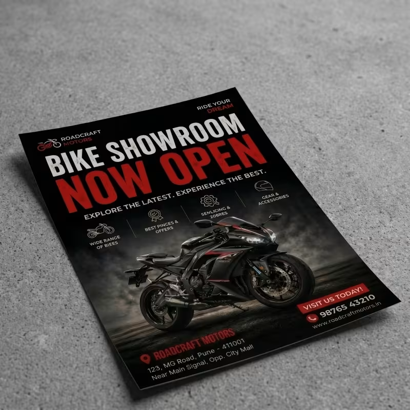
Different businesses and events require different flyer design approaches. A design that works for a retail sale may not work for a corporate seminar or a festive promotion. That is why it is important to adapt your flyer style based on the purpose, audience, and message.
Below are practical flyer design ideas for every business and event type that help maximize engagement and results.
Retail flyers should focus on attracting walk-in customers and highlighting offers.
Goal: Drive immediate store visits and impulse purchases
Corporate flyers should look professional and trust-building.
Goal: Build credibility and generate business inquiries
Event flyers must create excitement and urgency.
Goal: Increase registrations and attendance
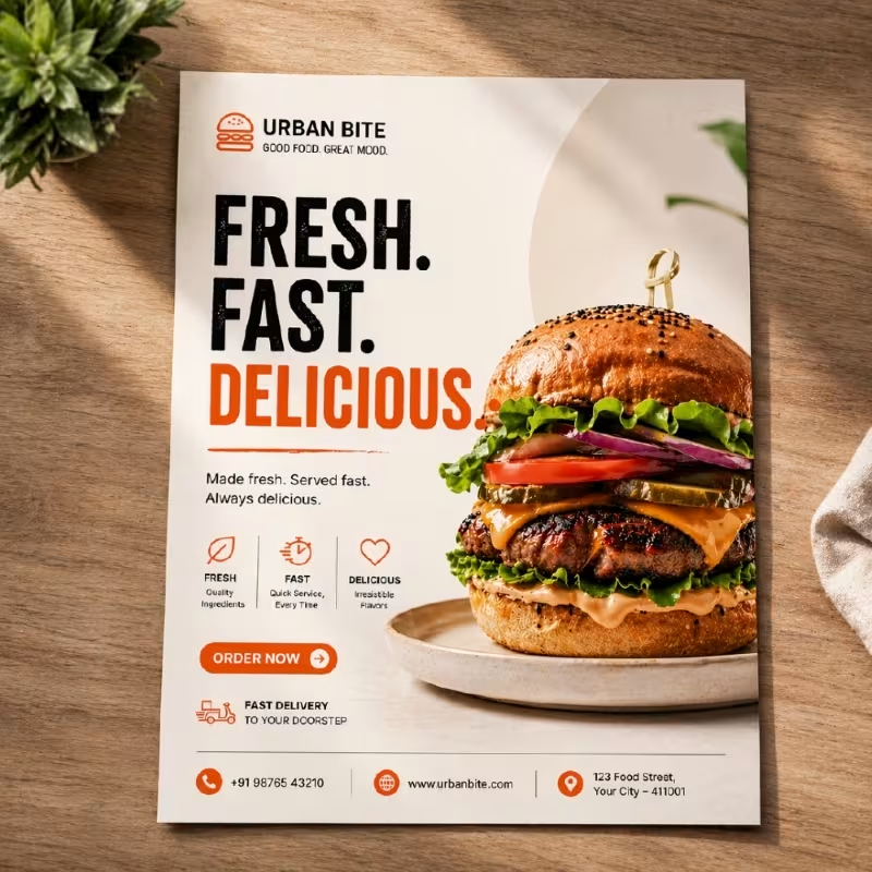
Food flyers should be visually appealing and appetite-driven.
Goal: Drive orders and footfall
Real estate flyers should focus on trust and visuals.
Goal: Generate inquiries and site visits
Education flyers should focus on clarity and benefits.
Goal: Increase admissions and inquiries
Festival flyers should feel emotional and celebratory.
Goal: Boost seasonal sales and engagement
Looking to expand your design strategy? Don’t miss our blog on poster design ideas to discover more creative ways to boost your business promotions.
Even a good marketing idea can fail if the flyer design is poorly executed. Avoiding common mistakes is essential to ensure your flyer delivers the intended results.
Flyer design is not just about appearance—it directly influences how customers perceive your brand and respond to your promotions. A well-designed flyer can significantly improve marketing performance across multiple areas.
Overall, good flyer design builds trust, improves clarity, and directly contributes to better business results.
Even the best flyer design won’t deliver its full impact if the print quality is poor. Printing plays a major role in how your brand is perceived and how effectively your message is received.
Design attracts attention, but printing defines the final experience. When both design and print quality work together, it creates a stronger and more effective marketing impact.
Creating an effective flyer starts with a great design, but the final impact depends on how well it is printed. High-quality printing enhances colors, improves readability, and gives your brand a professional edge.
Quapri offers reliable and high-quality flyer printing solutions tailored for business promotions, events, and marketing campaigns. Whether you need bulk printing or customized finishes, the right printing approach can make your flyers more impactful and result-driven.
With a focus on quality and consistency, Quapri ensures:
By combining effective flyer design with professional printing, you can create marketing materials that not only attract attention but also drive real customer engagement and business growth.
A5 is the most commonly used flyer size for promotions. A4 is best for detailed information, and DL is ideal for handouts and events.
A flyer format is the structured layout of a flyer, including headline, images, key message, details, and call-to-action arranged for clear communication.
Use a clean layout, minimal text, balanced spacing, consistent fonts, and high-quality visuals with a strong color theme.
The five parts of a flyer are: headline, visuals, body content, call-to-action, and contact information.
Use a simple template, keep one clear message, limit fonts, add relevant images, and avoid clutter.
A flyer should ideally contain 50–150 words to keep it clear, readable, and impactful.
Create high-impact, professional flyers with Quapri and boost your business promotions with designs that truly stand out. Also visit our catalogue to explore more marketing materials for your business.
No account yet?
Create an AccountUploaded Failed |  |