
Articles•11 October 2025
Top 10 Signage Design Elements to Make Your Business Stand Out
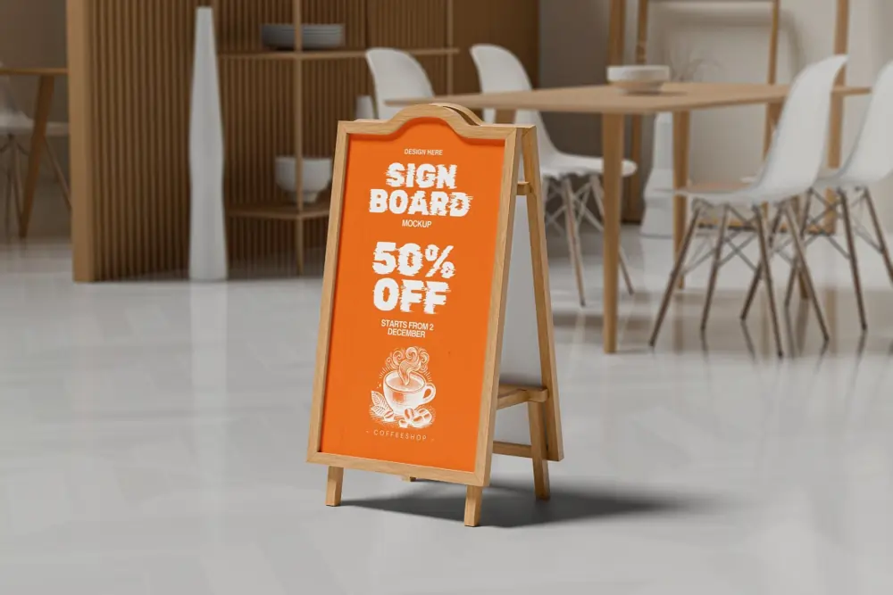
Top 10 Signage Design Elements to Make Your Business Stand Out! In today’s busy world, business signage is more than


Bulk Flyers
Bulk Flyer Printing Specifications and Paper Options
Paper Options
- 60 GSM Uncoated Paper – Textured surface, lightweight and cost effective
- 90 GSM Art Paper – Smooth finish, ideal for text heavy flyers
- Minimum order: 3,000 units
- Printing type: Single side offset printing
![Signage Board Printing in Bangalore [ Crystal Clear Signs ]](https://quapri.in/wp-content/uploads/2024/04/Acrylic-Signs-7-800x800.webp)


Custom Flyers
Flyer Printing Specifications and Finish Options
- Available Sizes: A4, A5 and DL
- Paper Thickness: Premium 130 GSM paper
- Finish Options: Matte Finish and Glossy Finish
- Printing Options: Single sided or double sided full color printing
- Minimum Order Quantity: Starts from just 25 copies
- Print Quality: Sharp, vibrant and professional quality output
- Delivery: Within 24 hours in Bangalore