




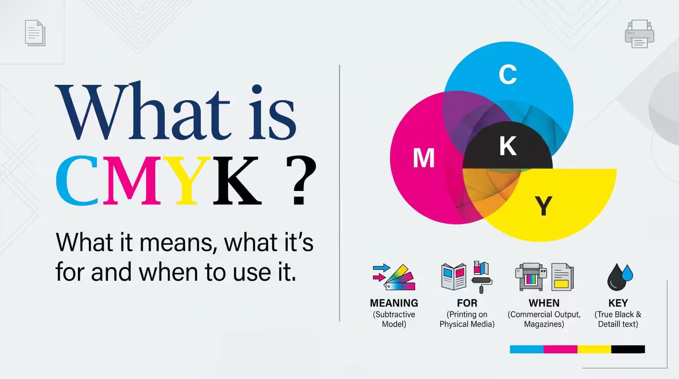
What Is CMYK? The Ink Code That Powers Print
What Is CMYK? The Ink Code That Powers Print What is CMYK? If your design looked perfect on your computer

What is CMYK? If your design looked perfect on your computer screen, but when you printed it, the colors looked different — CMYK ( Cyan, Magenta, Yellow and Black[k] ) is usually why that happens. The layout was perfect. The colors popped with crisp, bold accuracy on screen. Then the printed piece shows up, and something feels wrong. The blue seems duller. The red looks washed out. If that scenario sounds familiar, the explanation almost always comes back to one term: CMYK.
Whether you're putting together a flyer, ordering business cards, building product packaging, or producing marketing collateral, understanding CMYK helps you avoid color shifts, expensive reprints, and disappointing print quality. It also sets you up to create polished designs that print exactly the way you intended.
This guide breaks down what CMYK is, how the CMYK color model functions, where you'll encounter it, and how it stacks up against RGB, so your next print project comes out with accurate, dependable color.
What Is CMYK? The Color Formula Behind Every Great Print Job
CMYK is the color system used in printing. It combines four inks to create colors on paper and other printed materials. Unlike screens, which use light, CMYK uses ink.

Each letter in CMYK stands for one of the four inks used in modern color printing:
Cyan – A blue-green hue.
Magenta – A purplish-red tone frequently confused with pink.
Yellow – A vivid, medium-toned yellow.
Key (Black) – The black ink responsible for depth, sharpness, and contrast in printed work.
The "Key" in CMYK is shorthand for black ink. It earned the name "key plate" because it's responsible for fine detail and helps line up the other three ink colors during the print process. "K" is used rather than "B" so it isn't mixed up with blue from the RGB model. Black ink also boosts contrast, crispness, and overall print fidelity.
When cyan, magenta, and yellow are layered together in different proportions, they generate an enormous range of colors. Adding black ink on top sharpens text, deepens shadows, and tightens up color accuracy overall.
In short: CMYK builds color with ink on paper. Where RGB (Red, Green and Blue) builds color with light on a screen.
How CMYK Became the Print Industry Standard
The print industry didn't settle on CMYK randomly. CMYK fits printing because it matches how ink and printing presses actually function physically, whereas RGB is designed around light and digital displays.
A few reasons CMYK continues to dominate:
Predictability: The same CMYK values yield nearly identical output across long print runs
Consistency: Presses can be calibrated around ink-based CMYK with far more reliability than light-based color allows
Control: Designers and print shops get exact command over ink levels and final results
Another big reason CMYK keeps its place at the top of the print world is how reliably it reproduces the same color match every time. Across multiple copies of one design, CMYK keeps the color steady from the first sheet to the last.
That kind of stability matters enormously for businesses that need uniform branding across brochures, packaging, flyers, and other marketing pieces. RGB, by contrast, can shift slightly depending on screen settings and device calibration — CMYK gives far tighter control over how color behaves on physical material.
CMYK's dependability is exactly why it's the standard for commercial printing. Matching a design across hundreds or thousands of printed copies becomes far simpler because of the consistency CMYK delivers.
If you've ever wondered why virtually every print operation, from small neighborhood shops to massive commercial presses, runs on CMYK, that consistency is the answer.
CMYK in Real Life: Things You Use Every Day
CMYK used more in everyday items than people tend to assume. Keep an eye out, and you'll spot it again and again.

- Business cards and letterheads
- Brochures, flyers, and marketing materials
- Product packaging and labels
- Posters and large-format banners
- Magazines, catalogs, and printed books
Rule of thumb: if you can physically hold it, CMYK ink is almost certainly what put the color there.
1. Flyers
Flyers are among the most common applications of CMYK printing. Companies rely on them to advertise events, promotions, products, and services. Designing flyers in CMYK keeps color reproduction accurate and branding consistent across large print runs.
2. Brochures
Brochures typically include product photography, graphics, and detailed brand elements. Designing them in CMYK keeps those colors printing as intended and limits unexpected shifts between the on-screen design and the finished piece.
3. Business Cards
Because business cards carry a company's brand identity, color precision matters a great deal. CMYK printing keeps logo colors consistent, typography sharp, and the overall presentation professional.
4. T-Shirts and Apparel
Many custom apparel printers use CMYK color separation to reproduce detailed, full-color artwork. This lets printers produce vivid graphics on T-shirts and promotional merchandise while keeping the colors consistent.
5. Posters and Banners
Large-format pieces like posters and banners depend on CMYK printing to render photographs, illustrations, and brand elements accurately. Whether the use case is advertising, an event, or a retail display, CMYK keeps the visuals consistent at scale.
6. Packaging and Labels
Product packaging demands tight color matching to protect brand recognition. CMYK helps manufacturers reproduce identical colors reliably across packaging, labels, and promotional inserts.
7. Magazines, Catalogs, and Books
High-volume publishing depends heavily on CMYK printing because it delivers dependable color reproduction while staying cost-effective for large production runs.
At Quapri, we bring your designs to life across every format — from flyers and brochures to business cards, hangtags, posters, banners, and packaging — all printed with precise CMYK color accuracy so what you design is exactly what you get in hand.
CMYK and RGB A Quick Side-by-Side Breakdown
Both color models exist to produce color, but they arrive at it through completely different mechanics. Here's a side-by-side comparison:

The bottom line: RGB suits screens, CMYK suits print. Since RGB covers a wider color range than CMYK, some bright on-screen colors simply can't be matched exactly with ink.
Because of that gap, printed colors can come out looking less vibrant than their digital counterparts. Converting files from RGB to CMYK before sending themto print helps catch and fix potential color shifts early in the process.
CMYK Pros and Cons: The Good, the Bad, and the Print-Ready Truth
Like any color model, CMYK comes with both strengths and limitations. Knowing both sides helps you judge when CMYK is right for a project and what to expect while prepping files for print.
Advantages of CMYK
CMYK remains the industry standard for commercial printing because it delivers several key benefits:
- Accurate color reproduction for printed materials
- Consistent output across large print runs
- Professional-quality results with sharp text and deep blacks
- Reliable brand color matching across marketing materials
- Cost-effective for commercial printing projects
- Stronger control over ink coverage and print quality
Disadvantages of CMYK
CMYK is the go-to for print, but it isn't without drawbacks:
- Smaller color gamut than RGB
- Some bright or neon colors can't be reproduced precisely
- Printed colors may look less vibrant than their on-screen versions
- RGB designs may need adjustments after conversion
- Some projects require additional proofing and calibration
- Not the right fit for digital-only designs
CMYK or RGB? Here's How to Know Which One You Need
If your project is headed to a professional printer — whether it's a flyer, brochure, business card, poster, banner, product package, magazine, catalog, or custom T-shirt — CMYK is generally the right call. It delivers the consistency, predictability, and print accuracy that high-quality physical materials require.
For anything staying digital-only, RGB is still the better choice, since it offers a broader color range and is built for screen viewing.
Print-Ready Files 101: Getting CMYK Right Before You Hit Send
"Print-ready files" is a phrase nearly every printing partner will use, and it specifically means your file is already configured in CMYK, with correct resolution and bleed, before it ever reaches the press.
The biggest advantage here is simple: design directly in CMYK from the outset of a project instead of converting at the last minute. Last-minute conversions often introduce unexpected color shifts that aren't obvious until the finished piece is already in hand.
CMYK Simplified : Ready to Print Smarter with Quapri?
So, what does CMYK come down to in the end? It's the ink-based color system that makes accurate, consistent commercial printing possible, blending cyan, magenta, yellow, and black inks to build color on paper. Understanding how it works helps minimize unexpected color shifts and improves overall print quality.
Whether you're producing flyers, brochures, business cards, packaging, posters, banners, magazines, catalogs, or custom T-shirts, designing in CMYK from the start helps your printed materials turn out exactly as planned.
Before sending any file off to print, it's always worth double-checking color profiles and proofing requirements. At Quapri, we help businesses and individuals build print-ready designs and achieve professional-quality printing with confidence.
Ready to start your next print project? Contact Quapri today and let our team help bring your designs to life.
Looking for a full overview of everything we offer? Browse through the Quapri Product Catalogue.com to explore our complete range of printing solutions in one place.

Staple Notebook
Spiral Bind Notebook

Soft Bound Notebook
Premium Laminated Cards

Pocket Notebook

Notepads

Matte Laminated Business Cards

Kraft Cover Notebooks

Glossy Laminated Visiting Cards

Gate Fold Brochure

Custom Brochures
Bi Fold Brochure